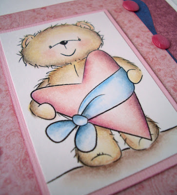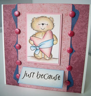
My first card this evening was supposed to be CAS but it took on a life of it's own and this is what I ended up with. Papers are a mix of Papermania and HOTP. The image is from the Digistamp boutique and I coloured it after following a link to this tutorial. I was a bit of a coward with my black pencil but I'm pleased with how it came out. The sentiment flap lifts up to say "I love you so much" (TAC stamps).

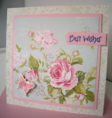
This next card doesn't meet my definition of CAS but it is very simple. I think the paper is just so pretty I couldn't really bring myself to cover it up.

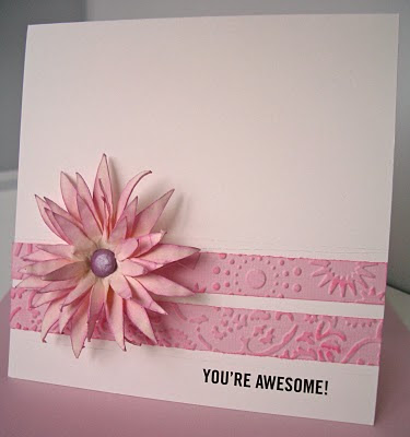
And lastly this is my entry to the CAS challenge on SCS which, this week, is a sketch. The sentiment is a Daisy Bucket rubon and the flower is one of those created last week. TFL and for any comments you care to leave.

15 comments:
Hi Julie,
3 so very different but fabulous cards i especially like your flower you have made and love the simplicity of the butterfly added to the dp x
hugs
Suzie Qx
Love the cards Julie and that middle one works so well...... just goes to show that papers can do all the talking!
You and me both being scared with the black pencil but it's so effective isn't it?!
Hugs Tara xx
Such beautiful cards. I so love the flower,am interested to know what flower punches you used to achieve this design,it's stunning x
Thanks also for the link to the colouring,so amazing!
Such an array of stunning cards Julie, I love the big bloom that you made, it is just FAB!
Keryn x
Oh fab Julie, love the flower. Kim
Hi Julie more beautiful creations.. thanks for the link to the colouring will give it a try..yours looks fab
Kerry x
Gorgeous hun the first is my fave though i have a huge soft spot for coco, husg Pops x
gorgeous cards and fab layouts
Julie, all fabulous and your wonderful colouring as always. Jane x
Gorgeous, gorgeous and gorgeous Julie.
They are all so different but very stylish. :)
Edna x
WOW... absolutely amazing....I would defo love to receieve any of these over shop bought... they look so much better.... so professional looking... keep up the awesone work darl ;o) love n hugz JustAng (Docrafts) xXx
simply beautiful cards!
It's clean, it's simple and it's GORGEOUS!! Viv xxx
Forgot to say how much I loved the first two! The bear is beautifully coloured! Fab use of DP too on the second one. Viv xxx
Post a Comment